Histogram In Excel: What Is It, Data Analysis Toolpak And The FREQUENCY Function!
Whether you’re in the business world or a teacher, this common data analysis tool is like a column chart showing the frequency of the occurrence of a variable in the specified range. A histogram in excel organizes a group of data points into user-specified ranges. The histogram compresses a data series into an easily interpreted graph by taking many data points and grouping them into logical ranges or bins.
Table of Contents
How To Make A Histogram In Excel
What is a histogram?
Wikipedia states that a histogram can be represented in the following way: “Histogram is a graphical representation of the distribution of numerical data.”
Most people would disagree with this definition, especially if you were to think about histograms in another way. Ever made a column or bar chart represent some numerical data? Most people have. A histogram is a specific use of a column chart where each column indicates the frequency of elements in a certain range. In other words, a histogram displays (in a graphical manner) the number of elements within the consecutive non-overlapping intervals, or bins. For example, you can make a histogram to display the number of days with a temperature between 81-85, 86-90, 91-95, etc. degrees, the number of sales with amounts between $50-$99, $100-$199, $200-$299, the number of students with test scores between 51-60, 71-80, 91-100, and so on.
Disclaimer: All the images are taken from Trumpexcel for reference purposes only.
Creating a Histogram in Excel 2016
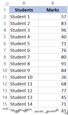
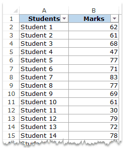
If you’re using Excel 2013 or previous versions, check out the two sections below(on creating histograms using Data Analysis Toolpak or Frequency formula). Suppose you have a dataset as shown below. The following has the marks (out of 100) of 40 students in a subject.
The following are the steps to create a Histogram chart in Excel 2016:
- Select the entire dataset.
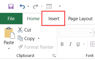
- Now tap on the Insert tab.
- In the Charts group, tap on the ‘Insert Static Chart’ option.

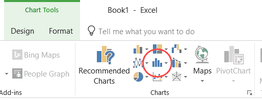
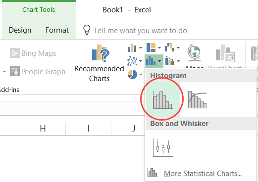
- In the HIstogram group, tap on the Histogram chart icon.

The steps above would insert a histogram chart based on your data set (as shown below).
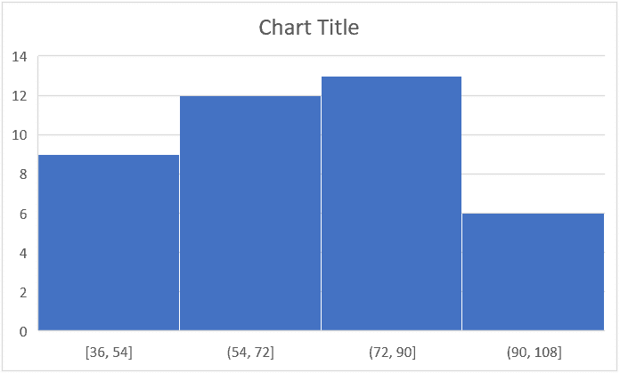
Now you can customize this mark sheet chart by right-clicking on the vertical axis and selecting Format Axis.
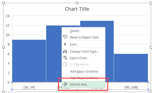
This will open a pane on the right with all the relevant axis options.
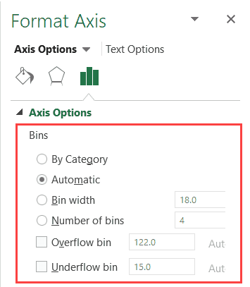
Want additional help to customize this histogram chart? Here’s what you can do:
- Customize Category: This customization option is used when you have text categories which is especially useful when you have repetitions in categories and you want to know the sum or count of the categories. For example, if you have sales data for items such as Printer, Laptop, Mouse, and Scanner, and you want to know the total sales of each of these items, you can use the By Category option. It isn’t helpful in our example as all our categories are different (Student 1, Student 2, Student3, and so on.)
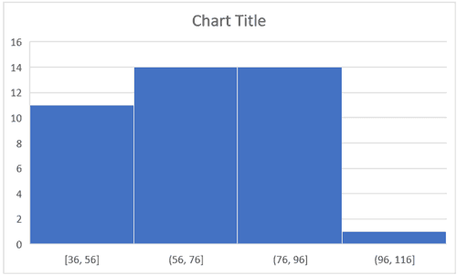
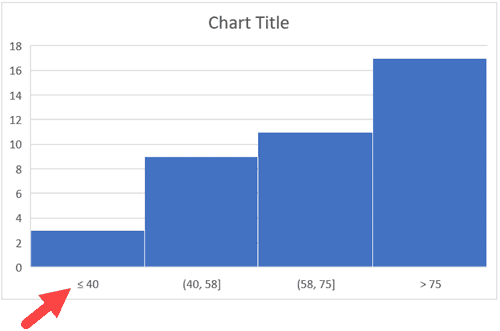
- Automatic: This customization option automatically decides exactly what bins to create in the Histogram. For example, in the chart above, it decided that there should be four bins. You can change this by using the ‘Bin Width/Number of Bins’ options (point below).
- Bin Width: With this custom option you can define how big the bin should be. If I enter 20 here, it will create bins such as 36-56, 56-76, 76-96, 96-116.
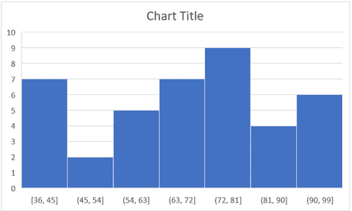
- Number of Bins: With this option you can specify how many bins you want. It will automatically create a chart with that many bins. For example, if I specify 7 here, it will create a chart as shown below. At a given point, you can either specify Bin Width or Number of Bins (not both).
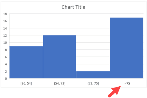
- Overflow Bin: You can select this bin if you want all the values above a certain value clubbed together in the Histogram chart. For example, if you want to know the number of students that have scored more than 75, you can enter 75 as the Overflow Bin value. It will show something as shown below.

- Underflow Bin: Similar to Overflow Bin, if someone wants to know the number of students that have scored less than 40, they can enter 40 as the value and show a chart as shown below.

With so many options, the world is your oyster. What next? Well, after you have specified all the settings and have the histogram chart you want, customize it even further (changing the title, removing gridlines, changing colors, etc.)
Creating a Histogram Using Data Analysis Toolpak
The Data Analysis Toolpak is a Microsoft Excel data analysis add-in, available in all modern versions of Excel beginning with Excel 2007. It will also work for all the versions of Excel. To create a histogram using Data Analysis toolpak, you first need to install the Analysis Toolpak add-in. This add-in enables you to quickly create the histogram by taking the data and data range (bins) as inputs. However, this add-in is not loaded automatically on Excel start, so you would need to load it first.
To install the Data Analysis Toolpak add-in:
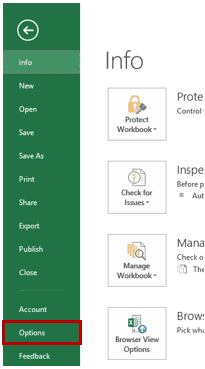
- Tap on the File tab and then select ‘Options’.
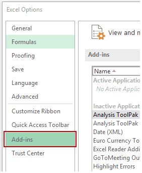
- In the Excel Options dialog box, select Add-ins in the navigation pane.
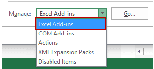
- In the Manage drop-down, select Excel Add-ins and tap on Go.
- In the Add-ins dialog box, select Analysis Toolpak and tap on OK.
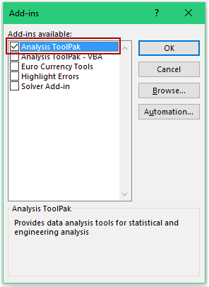
This would install the Analysis Toolpak and you can access it in the Data tab in the Analysis group.
Creating a Histogram using Data Analysis Toolpak
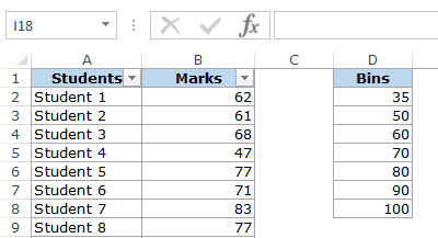
Once you have the Analysis Toolpak enabled, you can use it to create a histogram in Excel. Suppose you have a dataset as shown below. In this case, it has the marks (out of 100) of 40 students in a subject.
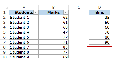
In order to create a histogram using this data, we need to create the data intervals in which we want to find the data frequency. These are called bins.
With the dataset given above, the bins would be the mark intervals. You need to specify these bins separately in an additional column as shown below:
Now that we have all the data in place, let’s see how to create a histogram using this data:
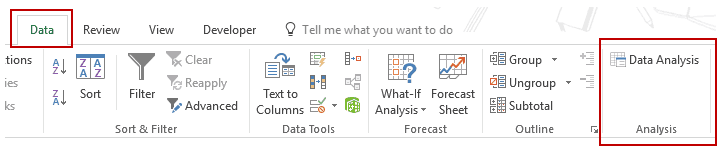
- Click the Data tab.
- In the Analysis group, click on Data Analysis.
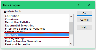
- In the ‘Data Analysis’ dialog box, select Histogram from the list.
- Tap on OK.
- In the Histogram dialog box:
- Select the Input Range (all the marks in our example)
- Select the Bin Range (cells D2:D7)
- Leave the Labels checkbox unchecked (you need to check it if you included labels in the data selection).
- Specify the Output Range if you want to get the Histogram in the same worksheet. Else, choose New Worksheet/Workbook option to get it in a separate worksheet/workbook.
- Select Chart Output.
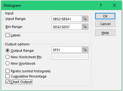
- Now tap on OK.
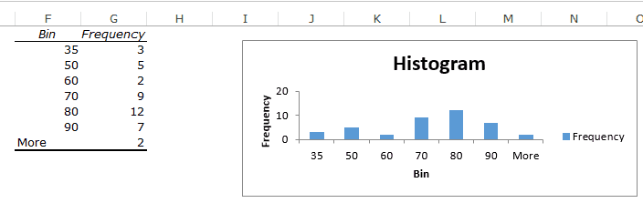
- What this does is insert the frequency distribution table and the chart in the specified location.
Finally, there are some things you need to know about the histogram created using the Analysis Toolpak:
- The first bin consists of all the values below it. In this case, 35 shows 3 values indicating that there are three students who scored less than 35.
- The last specified bin is 90, however, Excel automatically adds another bin – More. This bin would consist of any data point which lies after the last specified bin. In this example, it means that there are 2 students who have scored more than 90. Note that even if you add the last bin as 100, this additional bin would still be created.
- This creates a static histogram chart. Since Excel creates and pastes the frequency distribution as values, the chart would not update when you change the underlying data. To refresh it, you’ll have to create the histogram again. The default chart is not always in the best format. You can change the formatting like any other regular chart.
- Once created, you can not use Control + Z to undo it. To remove it, you will have to manually delete the table and the chart.
- If you create a histogram without specifying the bins (i.e., you leave the Bin Range empty), it would still create the histogram. It would automatically create six equally spaced bins and use this data to create the histogram.
Creating a Histogram using FREQUENCY Function
In order to create a histogram that is dynamic (i.e., updates when you change the data), you need to employ certain formulas.
In this section, you’ll learn how to use the FREQUENCY function to create a dynamic histogram in Excel.
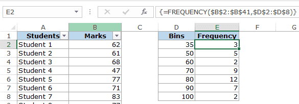
Again, taking the student’s marks data example, you need to create the data intervals (bins) in which you want to show the frequency.
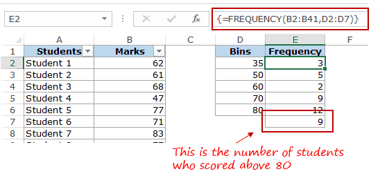
Below is the function that will calculate the frequency for each interval:
=FREQUENCY(B2:B41,D2:D8)
As it is an array formula, you need to use Control + Shift + Enter, instead of just Enter. Here are the steps to make sure you get the correct result:
- Select all cells adjacent to the bins. In this case, these are E2:E8.
- Press F2 to get into the edit mode for cell E2.
- Enter the frequency formula: =FREQUENCY(B2:B41,D2:D8)
- Combine press Control + Shift + Enter.
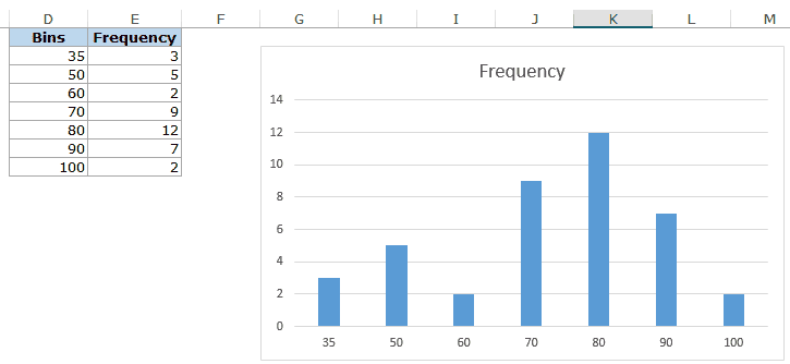
With the result, you can now create a histogram (which is nothing but a simple column chart).
There are some important things you need to know when using the FREQUENCY function:
- The result is an array and you can not delete a part of the array. If you need to, delete all the cells that have the frequency function.
- When a bin is 35, the frequency function would return a result that includes 35. So 35 means score up to 35, and 50 would mean score more than 35 and up to 50.
- Lastly, let’s say you want to have the specified data intervals till 80, and you want to group all the results above 80 together, you can do that using the FREQUENCY function. In that case, select one more cell than the number of bins. For example, if you have 5 bins, then select 6 cells as shown below:

The FREQUENCY function would automatically estimate all the values above 80 and return the count.